When improving the checkout page in your ecommerce store, there’s no better way of seeing what works and what doesn’t than looking at some checkout page examples.
Some of the most successful online stores out there have fine-tuned their checkout process over the years. They’ve done this to create a checkout experience that not only helps customers but increases their sales too.
? So in this post, we’ll explore some of the best. These checkout page examples contain some clever features that make a huge difference to these online stores.
The best part? We’ll show you how to apply these to your store so that you can reap the benefits too.
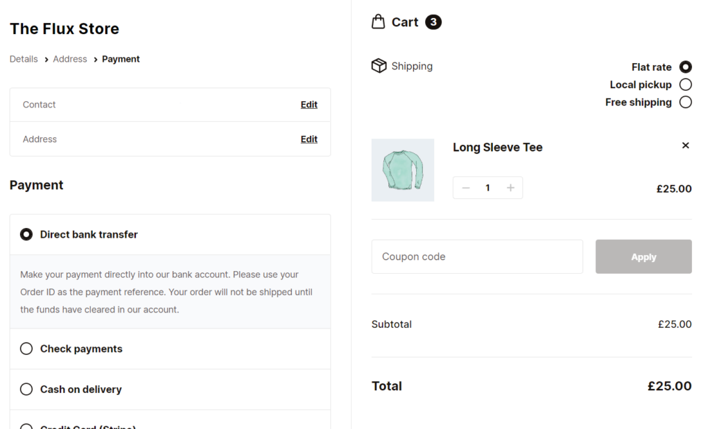
Flux Checkout for WooCommerce
Flux Checkout transforms the default WooCommerce checkout into one that’s lightning-fast, distraction-free, and reduces checkout abandonment.
Checkout page example #1: Nike
If you want a master class in checkout page design, look no further than Nike. This retailer has a seamless one-page checkout that acts like a multi-step checkout.
Nike’s checkout walks the customer through each step in the most simple way possible, but more importantly, it removes distractions.
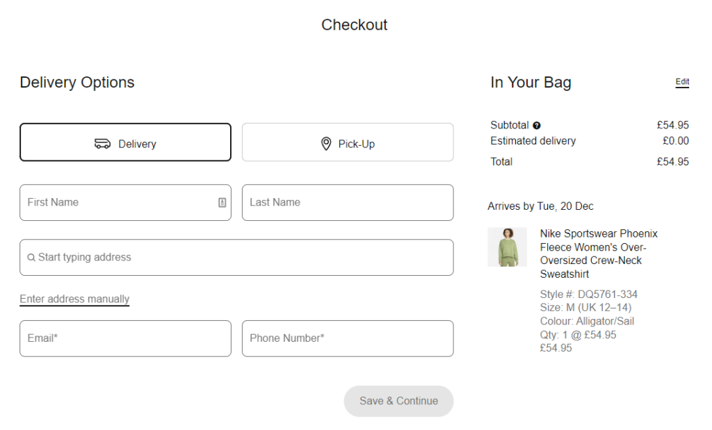
While browsing the rest of Nike’s online store and even at the shopping cart stage, you’re presented with the site’s menu, detailed footer, sidebar, and more. But while at the checkout, all of this disappears.
By removing these distracting elements, Nike makes sure the customer is focused on one thing, checking out.
This seemingly simple user experience tweak helps Nike reduce cart abandonment by removing the temptation for customers to click away.
Nike also has plenty of other features that make this checkout page example great:
- The order summary is always visible on the right.
- Customer support is only a click away in the top right-hand corner.
- The form fields and checkout buttons are large and easy to see.
- The design is minimalist yet bold, making the purchasing process straightforward.
- The checkout resizes and is easy to use on mobile devices.
How to make your ecommerce checkout page distraction-free
Let’s say you love how Nike handles their distraction-free checkout page design and want to implement it in your online store. How do you do it?
If your online store uses WooCommerce, the plugin Flux Checkout for WooCommerce has your back.
Flux Checkout allows you to completely upgrade your checkout into one that’s distraction-free and lightning-fast. Flux Checkout is an excellent option if you love Nike’s checkout page design and features.
The best part? You can set it up in minutes with a great checkout page that improves your checkout flow and cart abandonment rate.
Flux Checkout for WooCommerce
Flux Checkout transforms the default WooCommerce checkout into one that’s lightning-fast, distraction-free, and reduces checkout abandonment.
Checkout example #2: Our Place
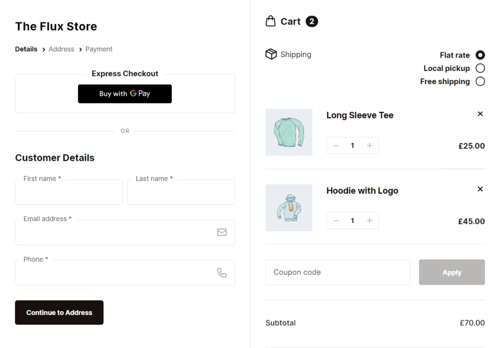
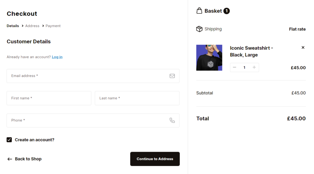
The checkout for Our Place is a great example of how a multi-step checkout prioritizes not only its guest checkout users but speed.
One of the first things you see when you land on Our Place’s checkout page is its express checkout option. This feature allows customers to checkout as quickly as possible. Especially if they use the payment methods ShopPay, PayPal, or Google Pay.
By making this a prominent feature, Our Place allows customers to skip almost the entire checkout process. They don’t need to enter their payment information or address. They just need to pick one of the multiple payment options, and the checkout page does the rest.
If the customer doesn’t want to use the express checkout, though, they can enter all their information as usual.
The way Our Place handles this, though, is pretty clever. They allow customers to checkout with a guest checkout option by default. If they already have an account, they can login at this stage too.
Adding a guest checkout allows customers to checkout quickly without the block of having to create a password or account. Using this technique, Our Place improves its conversion rate by reducing the steps customers need to take to complete their orders.
Our Place also has plenty of other features that make this checkout page example great:
- It recognizes you as an account holder if you enter an email address already associated with an account. It will then assign your order to your account.
- Multi-step checkout, which acts as a progress indicator, walking customers through an easy checkout process.
- All website navigation is removed, including the ecommerce store’s header, footer, sidebar, and more.
- A promo code spot is clearly visible near the shipping fees on the right, allowing potential customers to gain a discount which increases trust.
How to add a better guest checkout option to your checkout page
So let’s say you like how Our Place handles customer login, registration, and guest checkout options and want to add these to your ecommerce business. How do you do it?
Well just like the previous example, Flux Checkout for WooCommerce and WooCommerce itself can help you out.
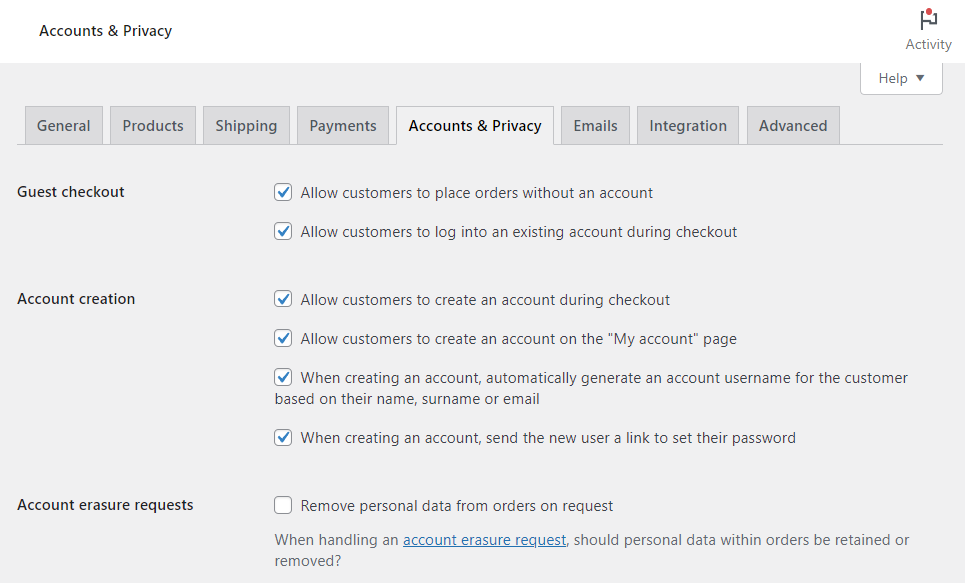
By default, WooCommerce allows customers to guest checkout, login, or register with your online store, just like Our Place does. Combined with Flux Checkout, these options are displayed in an easy-to-understand and straightforward way.
These guest checkout features mirror those found in the Our Place checkout. If you’d like detailed instructions for setting these up, check out our Flux Checkout Account Creation guide.
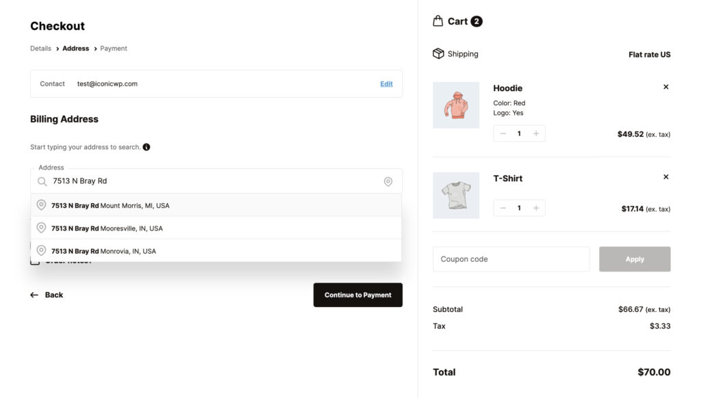
Checkout page #3: Beauty Bay
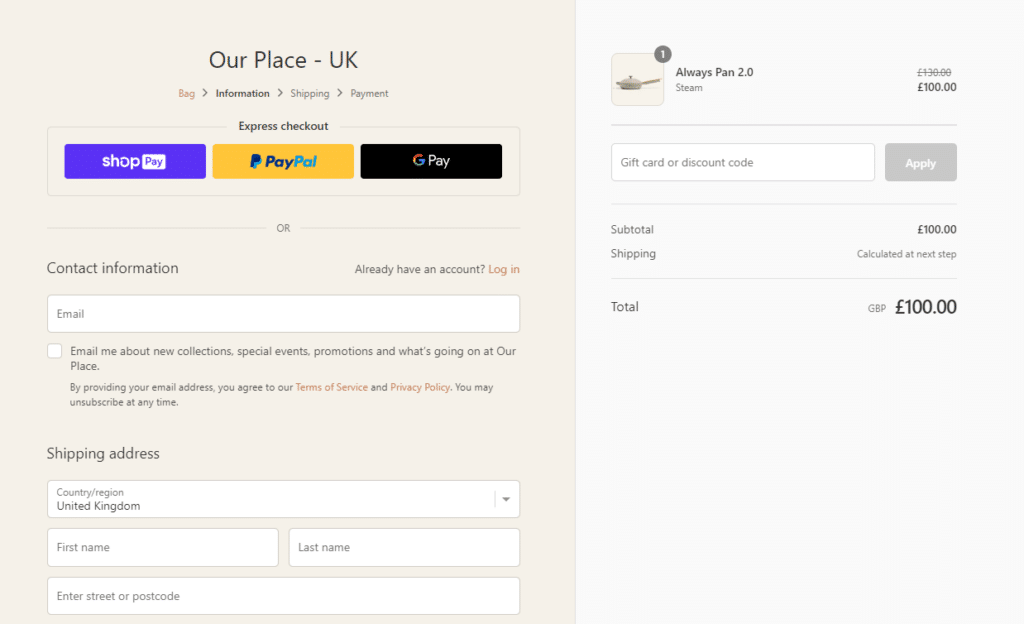
Beauty Bay’s checkout page is a great example of how simple and straightforward a great checkout page example can be. On the Beauty Bay ecommerce website, every single stage of the buying journey has been thoroughly thought-through and optimized.
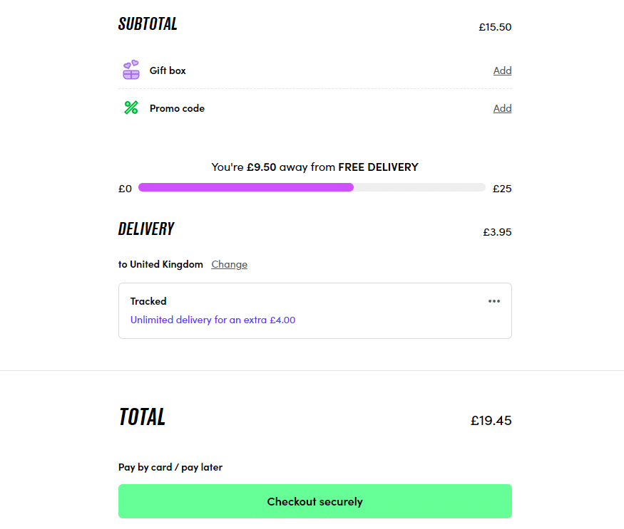
The checkout page is no different. Once you’re past the initial checkout page that’s designed to get you to spend a little more with a free delivery progress indicator, order summary, promo codes, and loyalty options, you get to the real checkout.
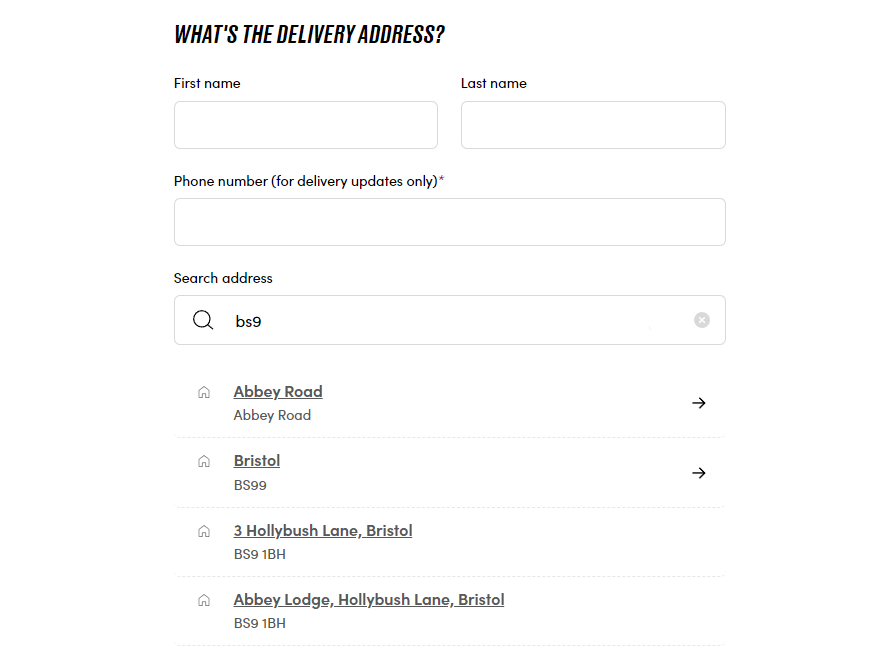
This page is a multi-step checkout that’s even simpler. However, there’s one specific feature we want to draw attention to at this checkout. Beauty Bay is all about getting you to checkout quickly and this feature does exactly that.
This feature is address autocomplete. At this stage of the checkout, Beauty Bay wants you to give them your address, but to save you time typing it in, they use address autocomplete to do the hard work for you.
This addition may seem small, but if you can save your customers time by reducing the steps they need to take, you’ll not only increase conversions, you’ll keep customers loyal too.
How to add address autocomplete to your checkout page
If you like this checkout page feature and want to add it to your ecommerce store, there’s no better way to do it, than with the WooCommerce checkout plugin, Flux Checkout for WooCommerce.
With Flux Checkout, you’ll be able to add address autocomplete to your checkout in just a few steps.
Customers will be able to input just a few characters in the field, and address autofill will do the rest, helping customers select their address and filling in the fields for them.
Flux Checkout for WooCommerce
Flux Checkout transforms the default WooCommerce checkout into one that’s lightning-fast, distraction-free, and reduces checkout abandonment.
Checkout page example #4: ASOS
Like the other checkout page examples on this list, ASOS has a checkout page design that’s not only tried and tested, but changes as new checkout page best practices are released.
ASOS’s checkout page has many excellent features, but for this example, we want to highlight one in particular. It’s use of upsells and cross-sells.
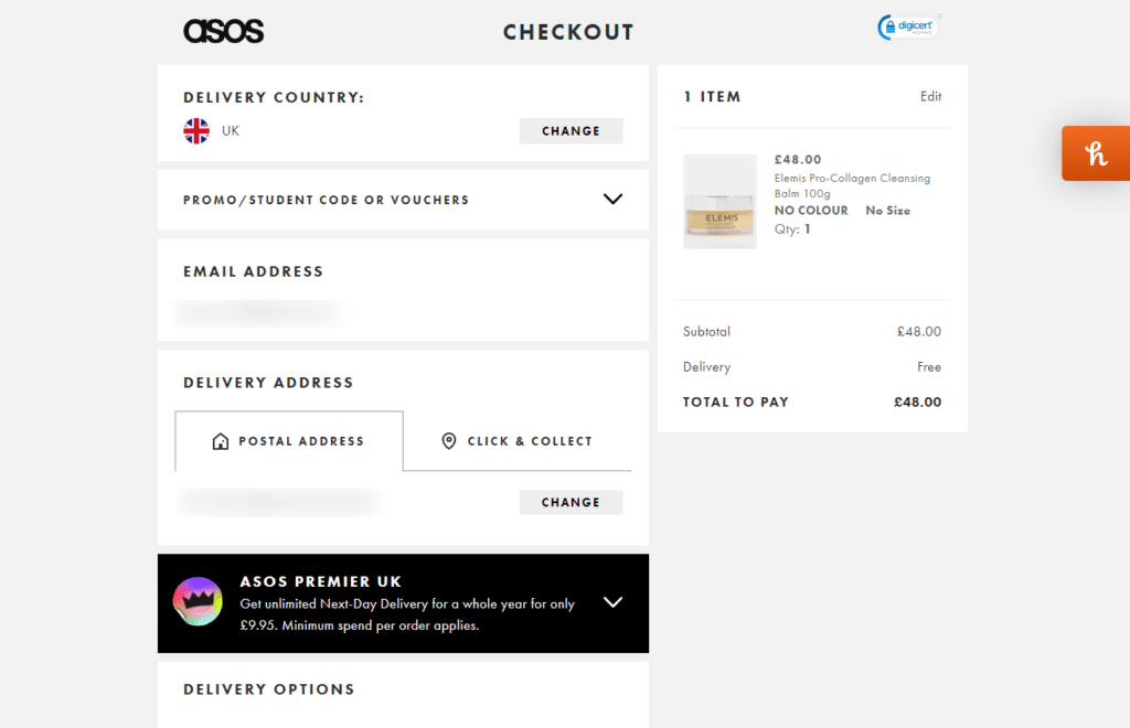
On ASOS’s checkout page, they upsell their premium delivery option. This upsell is a yearly cost that allows customers to get next-day delivery, and ASOS prioritizes it as an add-on to the customer’s order.
Adding an upsell or cross-sell like this to the checkout is clever because customers have already indicated their intent to buy. So by adding call to actions (CTAs), promotional pop-ups, or upsell notifications to this page, can serve to increase your average order value.
In this case, ASOS has added a no-brainer upsell to their checkout page, and you can too.
How to add upsells and cross-sells to your checkout page.
Adding upsells and cross-sells to your checkout page can have a huge impact on your overall sales and average order value. Plus, adding them to your store can be pretty straightforward, especially if you have a WordPress site.
With the plugin Iconic Salesbooster for WooCommerce, you can add cross-sells and upsells to not only your checkout page, but throughout your customer’s entire buying journey.
Like ASOS and even stores like Amazon, you can promote tailored products to your customers when they’re most likely to buy more.
Iconic Sales Booster for WooCommerce
Add cross-selling to your entire WooCommerce store in minutes with Iconic’s WooCommerce cross-sell plugin, Iconic Sales Booster for WooCommerce.
Checkout example #5: Sony
Sony’s checkout page is a great all-rounder with a good number of features that make it a great checkout page example to showcase.
Sony uses a multi-step checkout to guide customers through each stage. All of which are clearly visible at the top of the page, so you know exactly how many steps you need to complete your purchase.
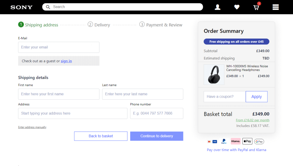
It also does a fantastic job of using trust signals. These take the form of all the payment options they support on the right-hand side. These are shown upfront, and before you get to the payment step, so you don’t waste time filling out checkout fields without knowing if they can take your specific method of payment.
Sony also ensures customers can see if there are any additional costs to their order and updates this as you move throughout the checkout process. For example, estimated shipping is shown on the right and only updates from TBD, to an actual cost once you pick your shipping method.
How to add clear shipping information to your checkout page
If you’re looking to keep customers in the loop and increase their trust in your ecommerce business, adding some of the features above to your checkout is an absolute must.
If you want to add clear shipping costs, a good order summary, and an easy-to-use multi-step checkout to your ecommerce store, Flux Checkout for WooCommerce has your back.
Flux Checkout’s design is very similar to Sony’s, with some additional features that simplify and allow customers to checkout even more easily.
The order summary, and order information on the right mirror Sony’s, as do the multiple steps in the checkout. Where Flux improves this design, however, is that it removes further distractions from the checkout page. Gone is the header and footer and additional clutter. Allowing customers to focus on checkout out as quickly as possible.
Improve your checkout with these checkout page examples today
This guide has showcased some of the best checkout page examples on the internet. Checkout page examples that use ecommerce best practices to give customers the best experience possible while checking out with ease.
Creating a similar checkout for your ecommerce store is straightforward with the right tools. With the following plugins in hand, you’ll be able to transform your existing ecommerce checkout into one that delivers all of the above and more.
Get both of the plugins mentioned in this guide individually below:
- Flux Checkout for WooCommerce – transform your WooCommerce checkout into one that’s lightning-fast and designed for conversions.
- Iconic Sales Booster for WooCommerce – Add cross-selling to every step of the buyer’s journey including the checkout with this sales-boosting plugin.
WooCommerce Conversions Bundle
Increase your WooCommerce store’s conversion rate and watch your revenue skyrocket. Includes Sales Booster, Flux Checkout, and WooThumbs.

Gina Lucia is our in-house Content Manager at Orderable. She writes articles, user guides, technical documentation, and creates videos on everything WooCommerce and Orderable.
Gina has been working in the WordPress/WooCommerce space since 2012 when she developed WordPress websites for clients large and small.
For the past 8 years, she’s been writing about everything WordPress and WooCommerce, becoming an expert in what makes a WooCommerce store succeed.
When not writing, Gina loves to tend to her vegetable garden, read, or travel to mainland Europe.