2
votes
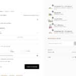
Would love to see an option to make the checkout right side window more compact. Right now there are big margins, large photos, and large descriptions making it difficult to see at a glance, especially if there is more than one or two products.
I’ve attached an example of a Shopify store that does this really well. The shipping at the bottom with the subtotal makes more sense than at the top, and all the items are neatly organized so they fit on one screen, even though there are a bunch of them.
Category: Flux Checkout
 theaudioguestbook shared this idea