How to Customize the Flux Checkout Style
If you want to change how Flux Checkout for WooCommerce looks, you can do so by following this guide.
Depending on the theme you’ve chosen (see our How to change the Flux Checkout theme doc for details), you’ll be able to customize it to suit you.
How to customize the header styles
Let’s start with the header styles. The header of your Flux Checkout will look different depending on which theme you’re using. Regardless, you’ll be able to customize it to suit you.
To customize the header styles of your checkout, take the following steps:
- From your WordPress dashboard, go to WooCommerce > Flux Checkout and click the Styles tab at the top of the page.
- Scroll down the page until you get to the Header Styles section.
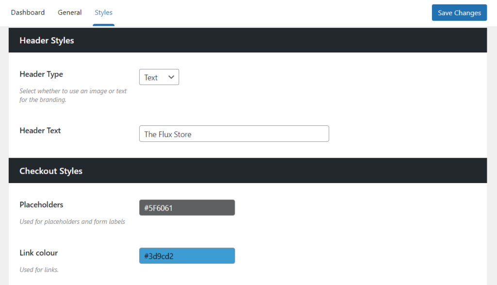
The options here will differ depending on which theme you’ve chosen, so we’ll go through each of them in turn.
Customize the Modern theme header styles
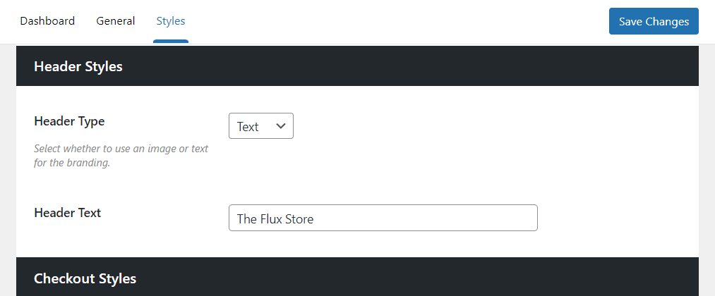
Flux’s Modern checkout theme has a very simple and clean header that draws focus to the checkout fields.
The two options you have here are:
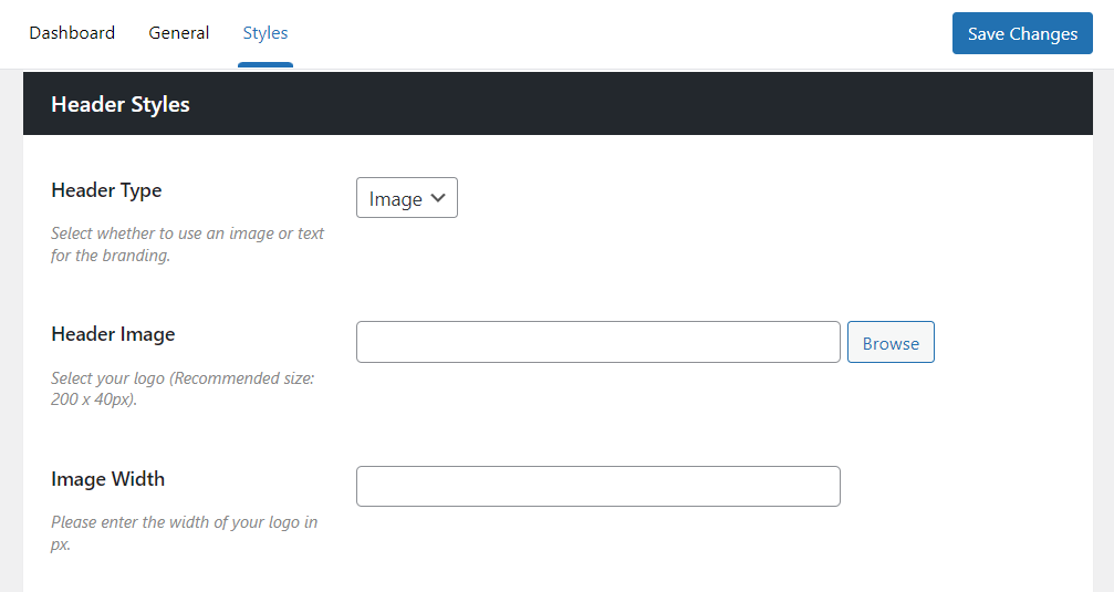
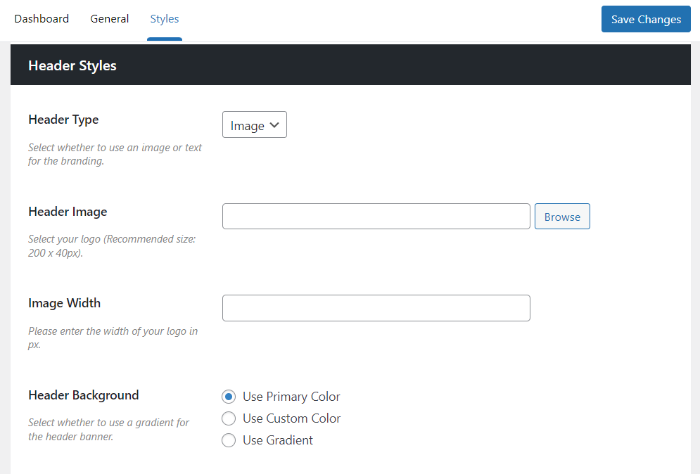
- Header Type – This dropdown allows you to select from Text or Image.
- If you select Text – The field below will allow you to input the text you want to see – usually your store’s name.
- If you select Image – Two fields will appear, allowing you to upload a header image (usually a logo) and set a width for that image if you need to.
Customize the Classic theme header styles
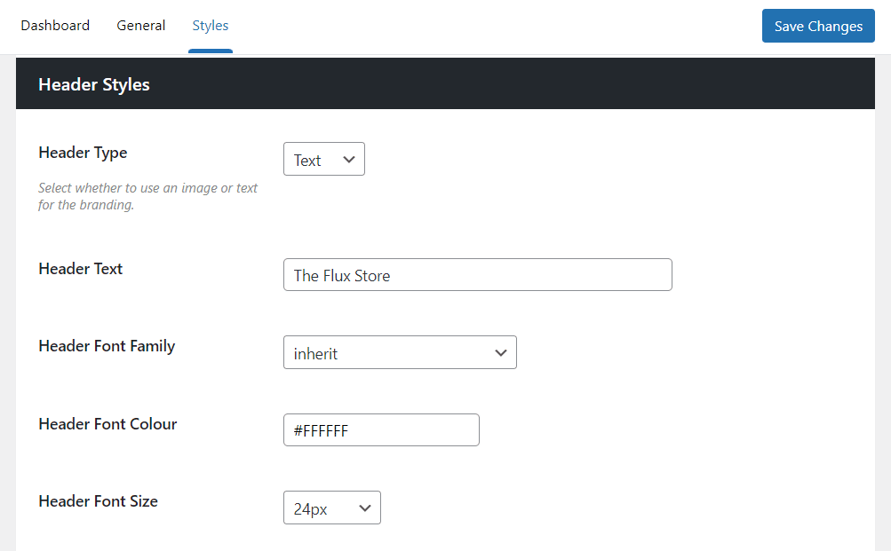
Flux’s Classic checkout theme has a bolder header design which allows for a bright pop, should you want it.
The options you have here are:
- Header Type – This dropdown allows you to select from Text or Image.
- If you select Text – A few fields will appear below. You’ll be able to input the text you want to see – usually your store’s name. You’ll also be able to customize the font family, color, and font size.
- If you select Image – Two fields will appear, allowing you to upload a header image (usually a logo) and set a width for that image if you need to.
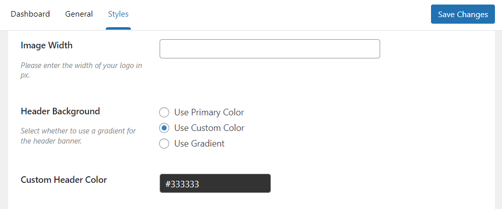
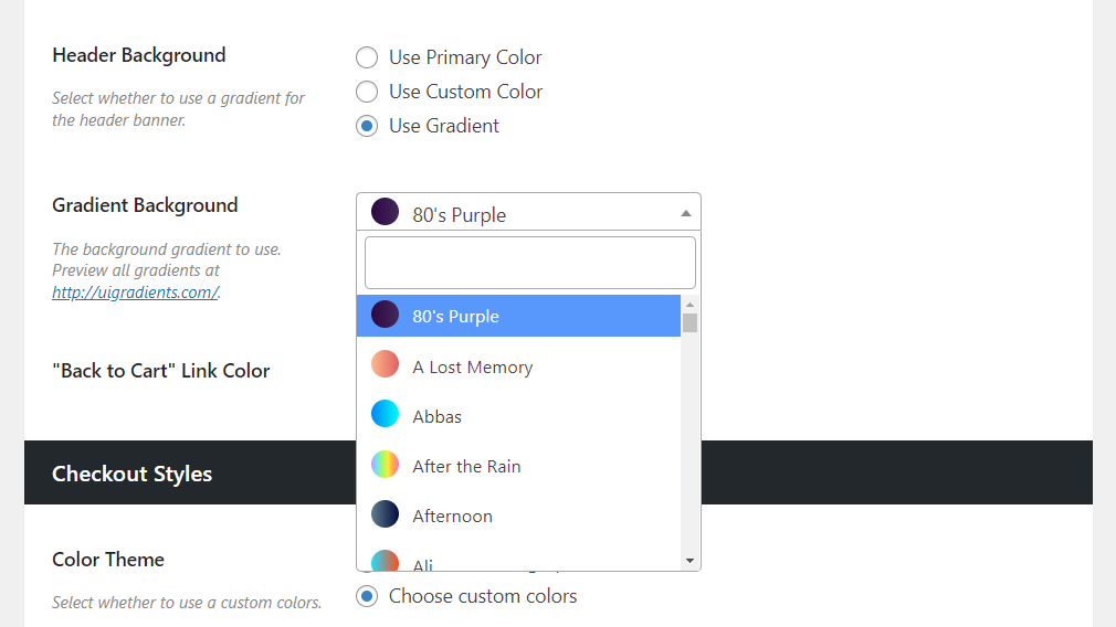
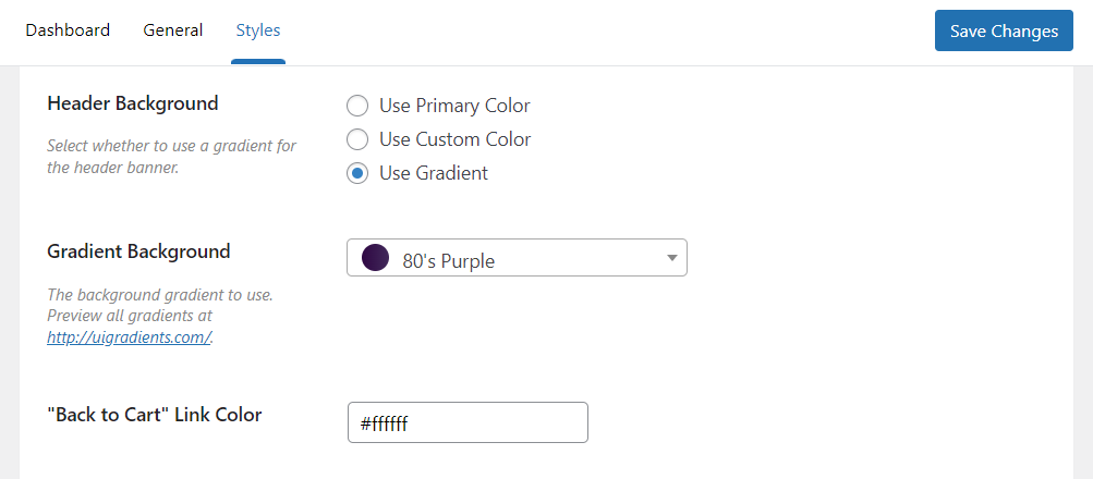
- Header Background – With this setting, you’ll be able to set the style for your header:
- Use Primary Color – This allows you to use the primary color from the Checkout Styles section further down the page.
- Use Custom Color – Allows you to select a custom color from the field that appears below. You can either add a hex code, or use the color picker to select.
- Use Gradient – Select from a vast list of pre-made gradient styles in the Gradient Background dropdown.
- “Back to Cart” Link Color – Next, you’ll be able to change the link color of the ‘Back to Cart’ text within the header. This is particularly useful if you’ve changed your header color and can no longer see the link.
How to customize the checkout styles
The checkout style settings allow you to set colors for specific links, buttons, and placeholders – depending on which theme you use.
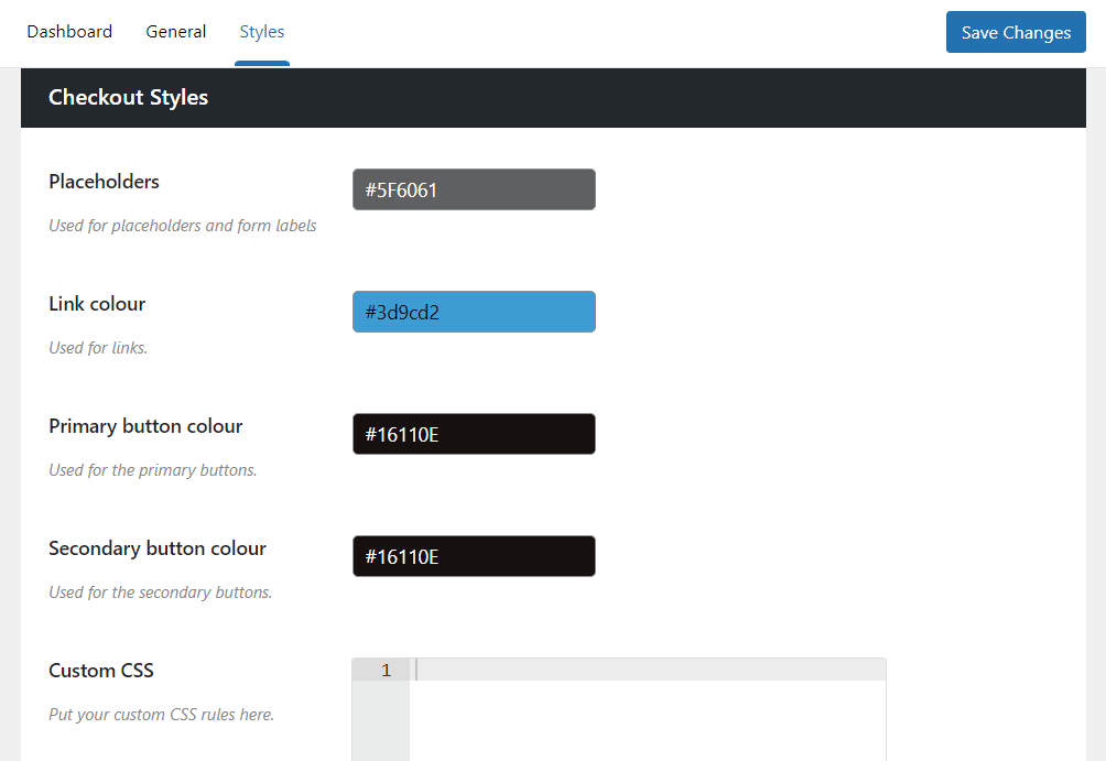
Customize the Modern theme checkout styles
Flux’s Modern checkout theme allows you to get a little more specific with the colors in your checkouts’ design.
The options you have here are:
- Placeholders – This is the color of the placeholder text within your form fields and your form labels.
- Link color – This is the color of any additional links that appear in your checkout. For example, the link to your privacy policy.
- Primary button color – The color of your primary buttons.
- Secondary button color – The color of your secondary buttons.
- Custom CSS – An additional section where you can add some custom CSS to override our theme’s styles should you want to.
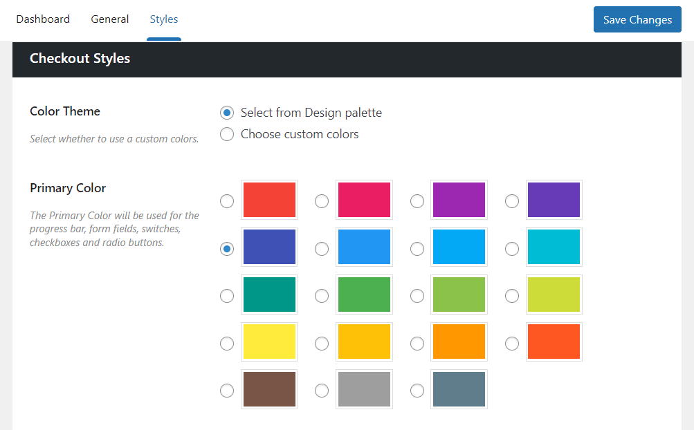
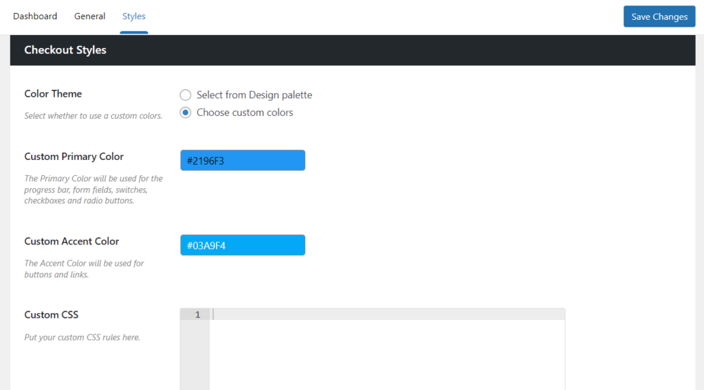
Customize the Classic theme checkout styles
Flux’s Classic checkout theme keeps things simple and takes care of the hard work for you with primary and accent colors.
The options you have here are:
- Color Theme – Pick from either Select from Design palette, or Choose custom colors.
- If you select the design palette – You’ll see a set of pre-made Primary and Accent colors for you to pick from.
- If you select custom colors – You’ll be able to add your primary and accent colors as hex codes or from color wheels. Then Flux Checkout will take care of the rest.
Once you’re happy with all your design changes, scroll up or down the page and click the blue Save Changes button to make them live.
Flux Checkout for WooCommerce
Flux Checkout transforms the default WooCommerce checkout into one that’s lightning-fast, distraction-free, and reduces checkout abandonment.
Was this helpful?
Please let us know if this article was useful. It is the best way to ensure our documentation is as helpful as possible.